Iterating on a homepage design
Role
Senior Digital Content Manager
Year
2023
Areas
UX/UI, Content Strategy

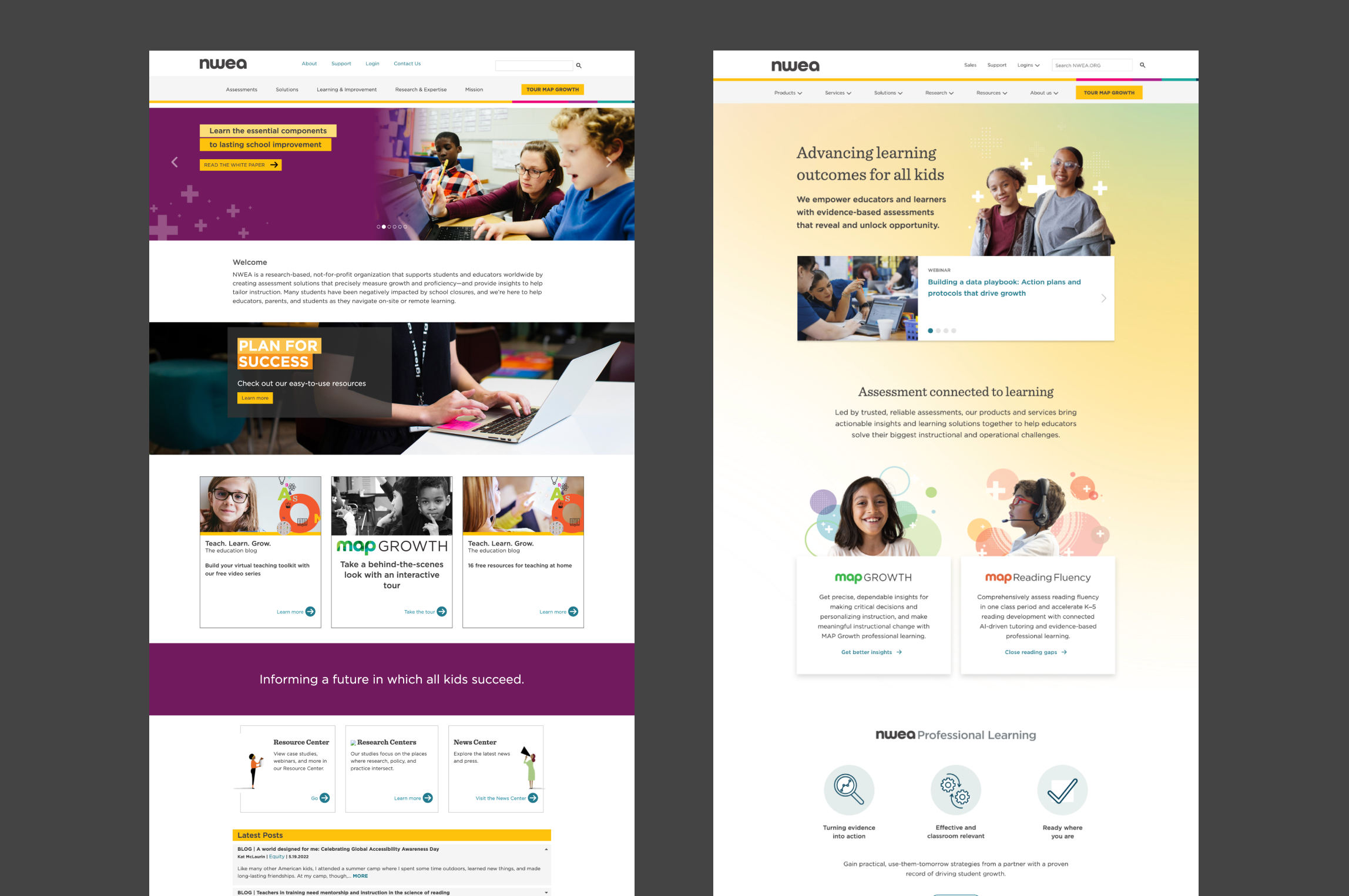
The original design of the homepage compared to the third iteration.
Background
Shortly after the main website rebuild, one of the first major design projects was the homepage. The page no longer reflected updated branding, was built to the constraints of a previous CMS, and did not effectively highlight the organization's products and services. The goal of the initial redesign was to address those issues while also presenting relevant resources to prioritized audience segments.
The results were mixed. While the updated page successfully reflected the refreshed branding and provided a more polished user experience, engagement did not meet expectations. Data showed that users were not interacting with the page as intended. The design was overly long, and the way products and services were presented failed to generate the desired traffic. After a couple of years, we returned to optimize the homepage with a sharper focus on driving engagement and product discovery.
Approach
We began with a review of site analytics, user behavior patterns, and stakeholder priorities to better understand how users were engaging with the homepage. This analysis guided a new strategy centered on simplifying the layout, surfacing clear pathways to products and services, and prioritizing content based on audience needs.
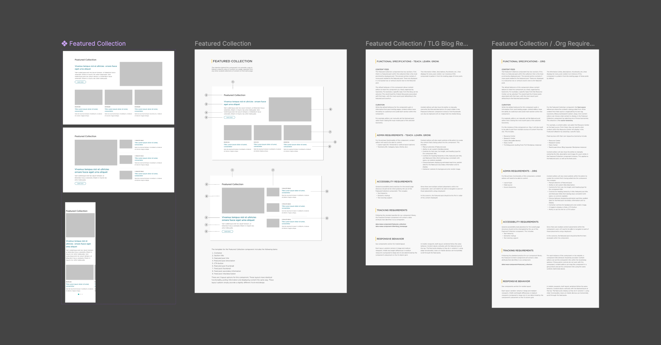
As we iterated on the redesign, I broke the overall page design into components and managed the development and QA of any new components or functionality. We were able to pull most of what we needed from what already existed, but also saw opportunity to utilize some of the components we used for a blog redesign for this project.
This also served as an opportunity to implement newer tracking features that I had been working on for the site. I wanted to improve our ability to associate user interactions with specific components. While that's simple enough with a component library, we needed a solution for the sections of pages assembled in the visual page builder. We found a solution to this by creating a way to arbitrarily group blocks together that could contain the required attributes for tracking.

Part of this project involved using previous component designs from the rebuild of a blog.
Impact
The optimized homepage created a more focused and effective entry point to the site. Users were able to identify and access relevant products and services more quickly, leading to increased traffic to priority pages. The streamlined layout improved clarity and reduced drop-off, while integrated tracking provided clearer insights into how each module performed. The redesign achieved a balance between brand expression and functional engagement, setting a stronger foundation for ongoing homepage iteration.

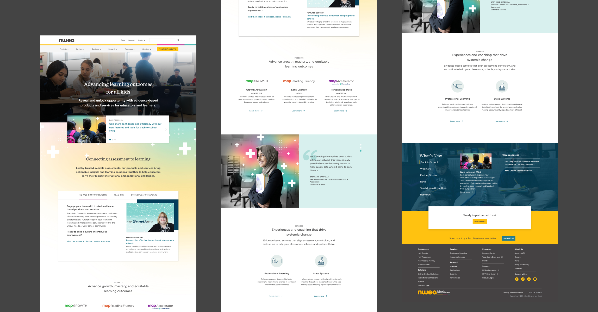
The second iteration of the homepage.

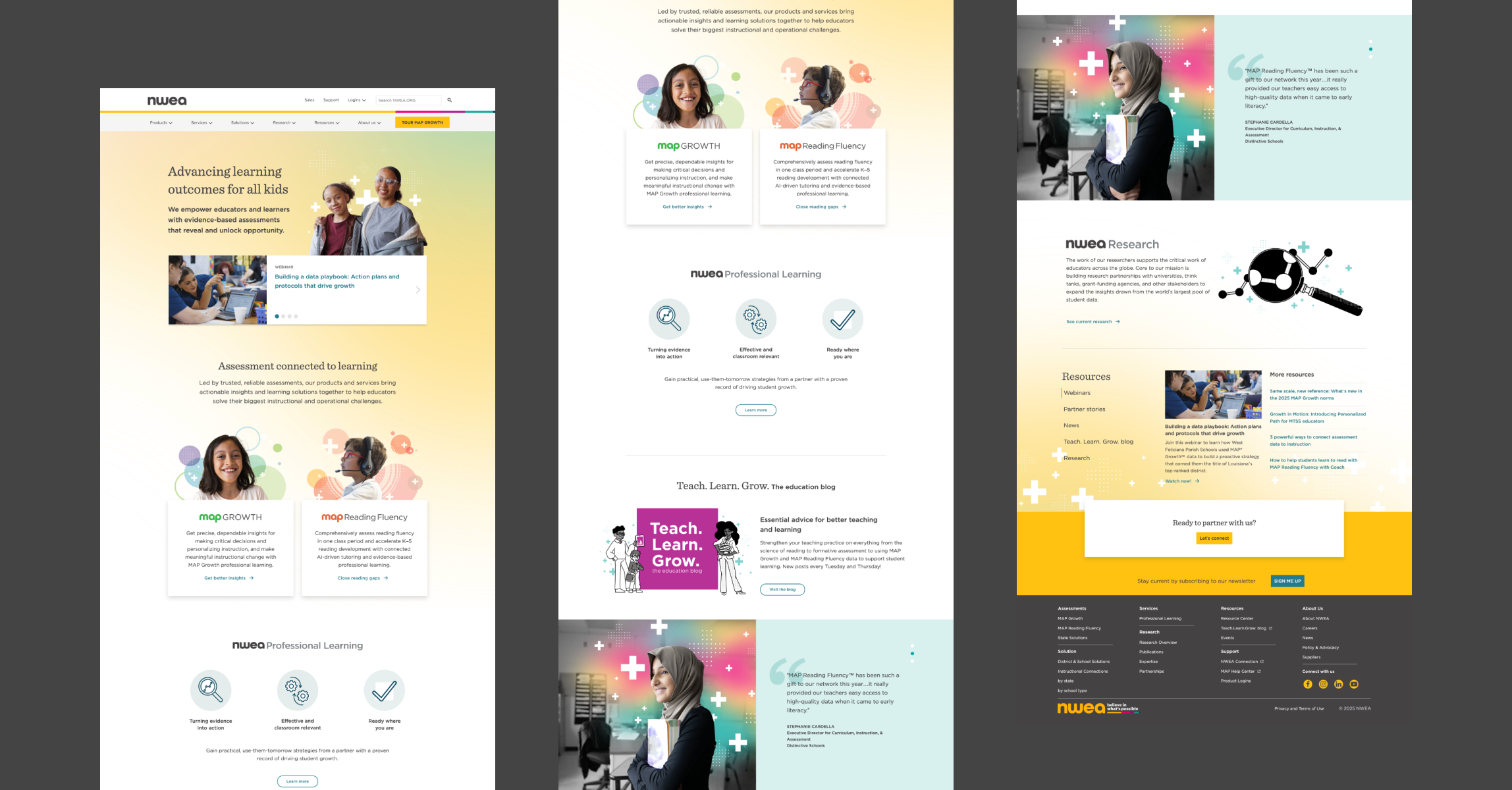
The third iteration of the homepage, with adjustments based off of the performance of the previous iteration.
+64%
+68%
+36%